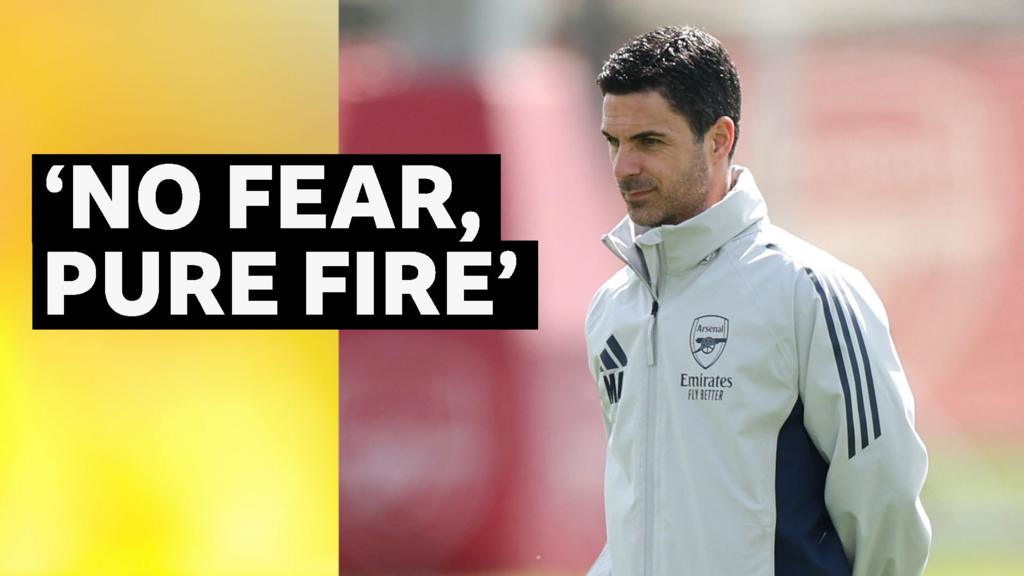
McLaren logo (2002-Present)
2560×1440 HD png

McLaren logo (1997-2002)
1920×1080 HD png
According to McLaren, “The revamped logo that first appeared in 1997 featured a streamlined speedmark which bares similarities to the vortices created by our rear wing. It appeared on the top of our cars’ side-pods. They evoke the aggressive markings found on predatory animals and insects.”

McLaren logo (1991-1997)
1024×768 HD png
In 1991, the three chevrons of the logo were replaced by just one, and the font was modernised.

McLaren logo (1981-1991)
2560×1440 HD png
Reflecting the sport’s international growth, the ‘Speedy Kiwi’ disappeared in 1981 to be replaced by the McLaren International logo. It was designed by Raymond Loewy and evokes a chequered flag.


To mark their move to the McLaren Technology Centre, the McLaren logo was refined and updated in 2002 with a more modern design; the now familiar speedmark was retained.
RELATED: McLaren vs. Ferrari: Which One is Better?